Modernizing a Legacy Website with Trusted UX
Reasons to Believe had decades of science-faith research behind a structure that had stopped serving it. The rebuilt site is organised around the questions visitors arrive with, modernizing the experience without spending the credibility built up around it.
Challenge
The project was to modernize their legacy website while retaining the trust of long-time users. Reasons to Believe has published science-faith research for decades, and the archive had grown far faster than the structure holding it. Visitors arriving with a specific question — about Adam and Eve, the age of the universe, whether God exists — had to already know the site's vocabulary to find an answer.
The audience skews long-tenured and deeply invested. A redesign that felt like a different organisation would cost more than it gained, so the work had to modernise the interface without spending the credibility built up around it.
Approach
The redesign is rooted in user empathy, strong UX patterns, and content clarity. Rather than reorganising the archive by publication type, the structure was rebuilt around the questions people actually arrive with, so the entry point matches the visitor's intent instead of the organisation's filing system.
View the live site — reasons.org ↗
What shipped
Question-led information architecture
The primary navigation is organised into topics — God, Jesus, Creation, Earth, The Universe, Life, Evolution, Humans, Spiritual Realm — and each opens into questions phrased the way a visitor would ask them: Does God Exist?, Who is God?, Is God Good?, Is Jesus God? Someone who has never heard of the ministry can navigate by curiosity alone.
Search as a front door
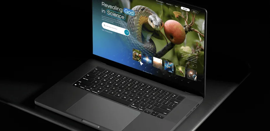
Search sits in the hero rather than tucked in a corner, prompting “Start your search here…” — an acknowledgement that for an archive this deep, browsing is the fallback and searching is the main path.
A homepage that states the premise
“Revealing God in Science” leads, with topic tiles beneath it. The proposition is legible in the first screen instead of being assembled from a menu.
Wireframes & site architecture
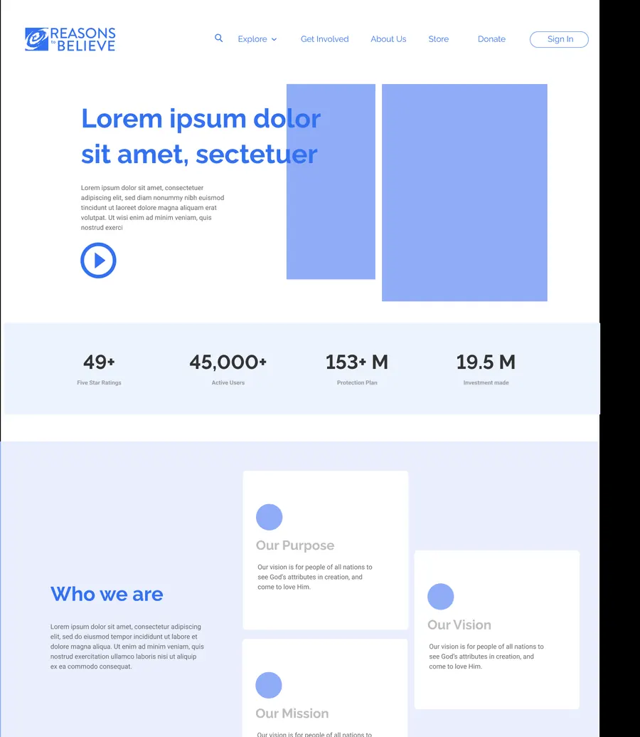
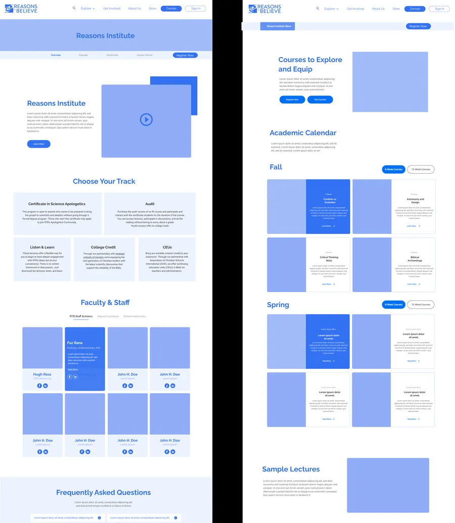
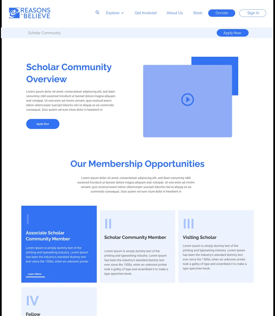
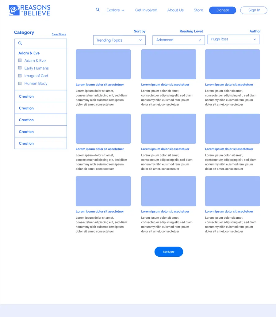
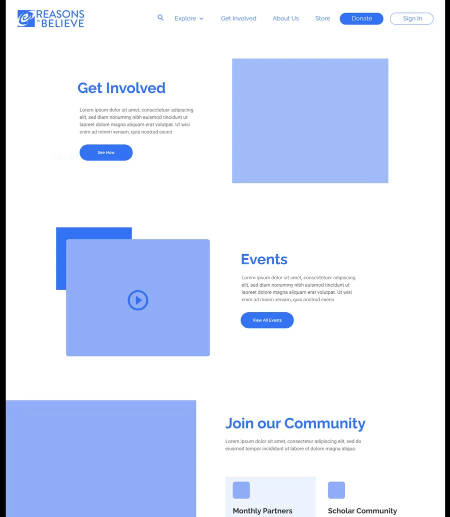
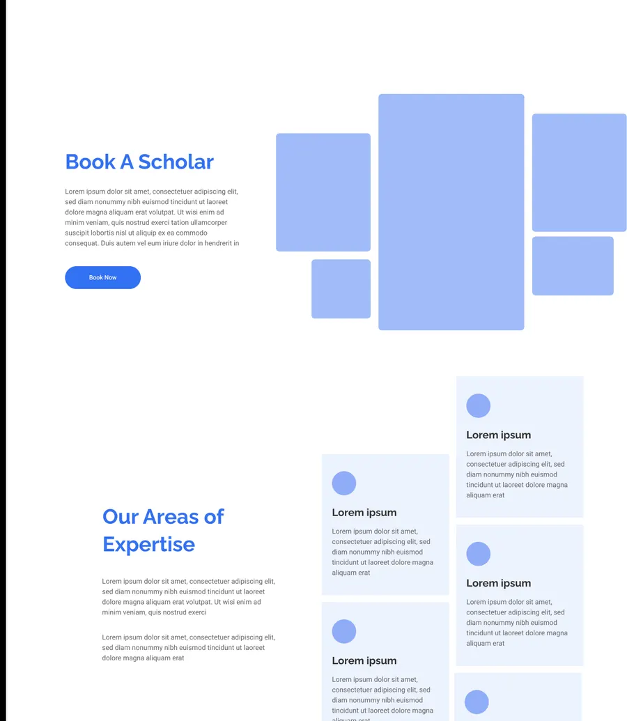
The rebuild was specified as 25 wireframed screens covering the whole site, not just the marketing pages — the education stack (Courses, Lesson Format, Certificates), the scholar programs (Scholar Community, Visiting Scholar, Fellows, Book a Scholar), the community and account areas, and the utility pages most redesigns leave until last: Search, 404, FAQ, Privacy Policy, Statement of Faith.
Working at that coverage meant the navigation could be designed against the real page inventory rather than a representative sample, which is what let the topic-and-question structure hold up once every template was accounted for.
Design system
The wireframes were paired with a UI style guide (rev. May 2025) so the build had one source of truth for colour, type, and component states rather than decisions being made per-template.
Palette
Type scale
Two families with a clear split: Questrial carries display sizes at a flat 400 weight and 1em leading, Kanit handles everything at UI scale where weight does the work.
| Element | Family | Size | Line height | Weight |
|---|---|---|---|---|
| Page title | Questrial | 60px / 3rem | 1em | 400 |
| H1 | Questrial | 60px / 3rem | 1em | 400 |
| H2 | Questrial | 40px / 2rem | 1em | 400 |
| H3 | Questrial | 32px / 1.6rem | 1em | 400 |
| H4 | Kanit | 24px / 1.2rem | 1.1rem | 400–700 |
| H5 | Kanit | 16px | 1em | 400 / 700 |
| Body | Kanit | 16px | 150% | 300 |
| Small / caption | Kanit | 14px | 1em | 300 |
| Input | Kanit | 16px | 22px | 300 |
| Button | Kanit | 16px | 1em | 300 |
Components
Buttons are specified across fills, outlines, and disabled treatments, each with static and active states — including the circular arrow and expandable “See More” variants used through the site. These are live: hover or tab through them to see each state.
Primary
Expandable
Directional
Conclusion
The rebuild replaced a structure that had stopped serving its own archive. Decades of science-faith research are now reachable by the questions people actually arrive with — Does God exist?, Is Jesus God? — rather than by the ministry's internal filing categories, with search promoted to a front door instead of a fallback.
Specifying all 25 screens up front, down to Search, 404 and Statement of Faith, meant the navigation was designed against the real page inventory rather than a representative sample. Pairing that with a documented style guide gave the build one source of truth for colour, type, and component states, so the system held together across templates instead of drifting page by page.
The modernization landed without spending the credibility the organisation had built up — the site reads as current, but still as itself. It is live at reasons.org.
Stack
Available for select projects
Have a project in mind?
Fifteen years of shipping digital products for teams like datacenterHawk, Marriott Vacations and Reasons to Believe. Tell me what you’re building.
Prefer email? info@solomonpadilla.com